Question 3
Visit the St. Clair College website. Analyze it strictly from a visual marketing strategy perspective targeting:
Local domestic high school students.
You are to provide three strategic visual enhancement recommendations.
For each recommendation:
a) Clearly identify the issue or missed opportunity (3 x 2 = 6 Marks)
To start the first issue I identified on the homepage was a majority of the clickable buttons are vague in purpose. What I mean by this is that I was unsure of what was a link to another page and what wasn’t. It feels as if this could be fixed easily.
The second issue, or rather missed opportunities I saw when thinking like this websites audience is a local graduating high school student was not having a FAQ for their general inquiries. Instead they just list departments people can reach out to. When some of these departments' emails don't even need to be listed if people can find the answer to their question. Not only would this save st clarify time by not having to answer as many emails but it would also help the site users.
This is an example, but I found there to be a lot of redundant links in sections that don’t have anything to do with the topic. This is one example above, why is IT services listed only under international students? This is one of many weird link placements I have noticed on this website. This is an issue because it makes the college look disorganized.
b) Propose a specific visual improvement (3 x 2 = 6 Marks)
If our target audience is catered towards local highschool grads I would have a front and center open house link as well as a CTA to apply on the image section. I would also get rid of corporate training completely for this purpose. It feels like it isn’t really serving anyone and just taking up space.
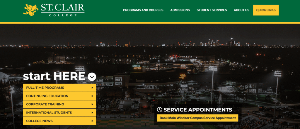
Another fix would be to change the hero image. This isn’t exactly driving action or telling a story for what St Clair College is. If we could change it to show the success of students, for example, graduating that would make people take action. It would help students make a decision of coming to this college by using logic.
These drop down menus are unflattering and frankly include unnecessary pages. I would change these drop down menus to pop out more, using yellow as the background color. My reasoning behind this would be to make this website more exciting. I feel like overall it is pretty bland and boring. It feels like this college is a hospital. College is supposed to be fun and rewarding. So we should show that.
c) Explain why it would improve recruitment effectiveness (3 x 2 = 6 Marks)
By making changes to the three proposed edits above not only would it improve recruitment effectiveness, it would also make the site more user-friendly to existing students. The photos we have on our page don’t showcase any of st clairs good attributes. The home page photo quality is a little blurry which makes me think “why would I go to a school that doesn’t take good photos on their website”. You mentioned we are photosnobs. This is also true for the students looking to enroll. Photos matter and st clair can showcase a more students success then just a night photo of a maybe a football game?
I also mentioned the photo should show students graduating. This would help improve recruitment by showing the success of other students. It would make the people applying think about being a graduate and would drive them to take action.
I did mention as well to have a more clear CTA. If I was a high school student looking into St. Clair College I probably wouldn't know where to begin applying. We should have open house bookings available front and center to help these students with applying and making a decision for what program would be best for them.
Lastly, the drop down menus and nav as a whole is fine. But it could be better. The colors have to stay the school color but they don’t really seem like pages I would want to click on. I feel as if this whole site has too much content and it makes navigation difficult. If we updated our drop down menu or made it pop out more, maybe it would cause people to investigate the site more.
d) Connect it to student psychology and digital behaviour (3 x 2 = 6 Marks)
Students that are applying out of high school are very instructions driven. The vast majority of new generations that are applying out of high school, don’t have the critical thinking skills that st. Clair college’s website seems to think they do. We know people don’t like to read or spend time on a website that does not have the answer we are looking for in a plain site.
With these updates suggested we will take care of any unnecessary pages and confusion that future prospects may face. I mentioned different photos for the hero images. This was because people like stories to match our messaging. My idea reiterates to students that St. Clair tells a story of success.
(24 Marks Total)